Re-Public
RESPONSIVE WEBSITE"Our data is being monetized, just not by us.”
Problem
Your data is big business. Keith Axline, founder of the start-up Re-Public is making strides to bring users a way to have true agency over their own data. Their website gets the job done, but has a few design flaws and lacks in the strong visual identity that an entity like Re-Public should have.
Solution
How might we design a responsive website that fixes the current issues within the interface and visually embodies Re-Public as brand?
Context
Contract Job
Contract Job
Role
UI/Visual Designer
Art Direction
UI/Visual Designer
Art Direction

ANALYSIS
The user analysis.
What I loved about redesigning Re-Public was all of the potential that came handed to me. Some of the positives were:
Excellent written copy
When I began redesigning Re-Public, I wasn’t super knowledgeable in what it was they actually did. The copy on the page made their mission and company values easy to understand.
Content hierarchy
The landing page is split into modules that make the visual story flow and the page is easy for the user to follow. I re-used the sections for the flow of my redesign.
Branding
Re-Public has a great logo, color palette and font set for me to work with.
Scrolling through Re-Public’s website before:
I performed a user analysis on the site and noted some of the issues I experienced. I determined that some flaws were:
Button or nah?
The “features” section displays text in a thumbnail card style and has a rollover/hover effect as if each card was a button, but they weren’t buttons:
![]()
Conversely, in the “bridge to the future” section, the “past”, “present” and “future” cards are buttons that the user can click to reveal more text, but are hardly noticeable
![]()

Conversely, in the “bridge to the future” section, the “past”, “present” and “future” cards are buttons that the user can click to reveal more text, but are hardly noticeable

Spacing and responsivity
There’s a lot of copy to get Re-Public’s point across, and at some points it’s overwhelming to the user. I wanted to let the website breathe with more negative space. There was also a lack of mobile responsiveness for the nav bar.
Generic visual identity
Although Re-Public had a fine scheme to work with, it could easily be redesigned to be stronger in presence and as a brand.
IDEATION
Initializing a redesign.
Start with the source
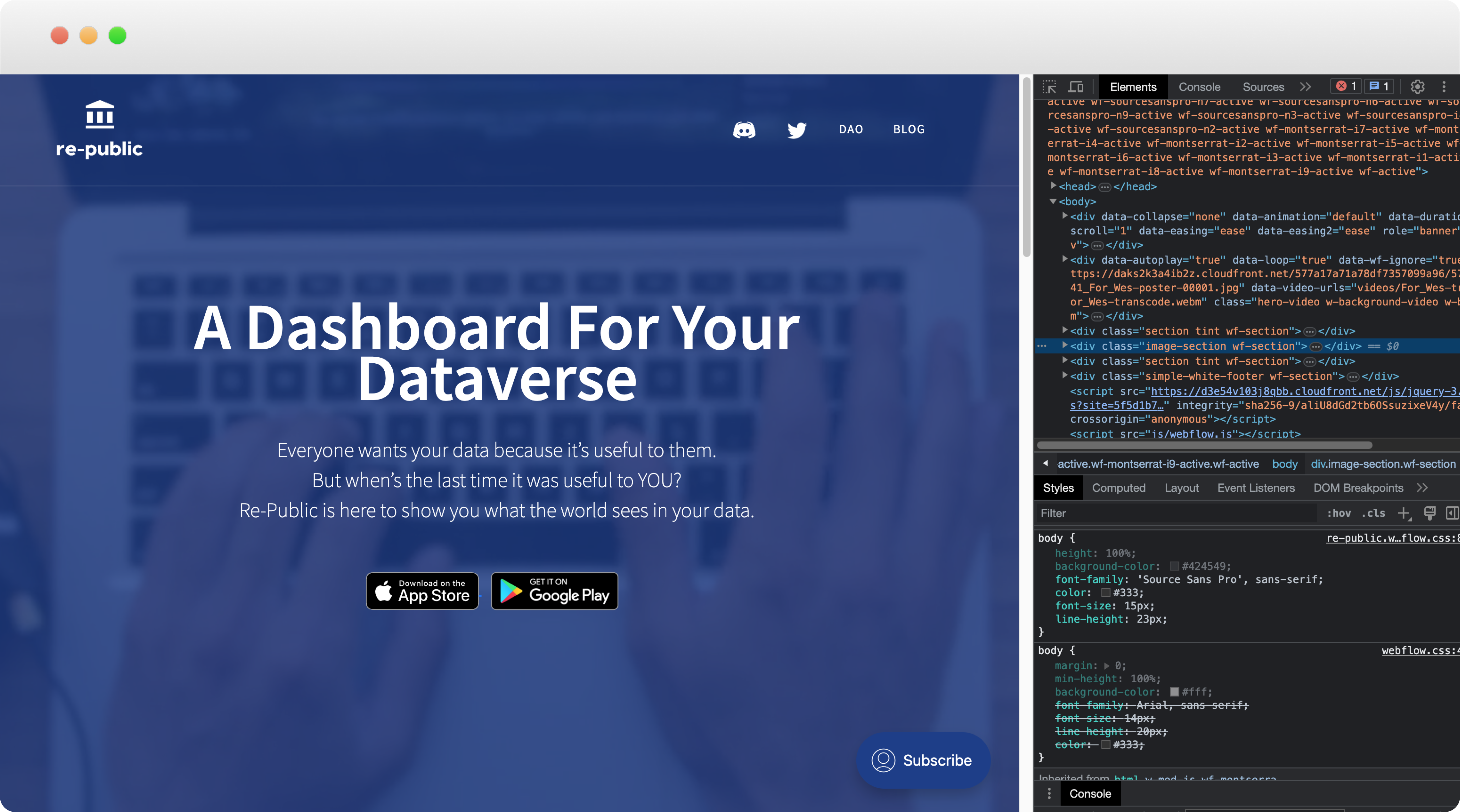
I opened up the developer panel on my browser and pulled the colors, fonts, and any other applicable UI elements so I could assemble a visual design system for Re-Public.

Gathering inspiration
Re-Public is a start-up geared towards an incredibly important mission— your data. They don’t take your data lightly, and neither should their brand. Re-Public should look professional, reliable, modern, and have an air of authority. I referenced design cues from apps like Stripe, Chargeflow, Synder, Canvas, etc.

YOUR DATA IN YOUR HANDS
Interact with your own data.
By moving your mouse along the header’s content, you interact with the data on the screen. Re-Public’s aim is to put your own data in your hands. I designed the UI to directly parallel this message though the design.
A RESPONSIVE EXPERIENCE
Re-Public, a dashboard for your dataverse.
The updates I made for the redesign are:
︎ Clever ways to streamline the page text.
Re-Public’s previous webpage was text heavy, and put users off to reading everything on the page. By utilizing methods like toggles, dropdown menu buttons, carousels, etc I could hide chunks of text on the page but still give users easy access to additional information.
︎ Keeping important functions visible.
Re-Public wants users to download the mobile app they’ve developed, yet the nav bar and buttons disappeared when scrolling on their previous website! The redesign keeps the most important navigational functions stickied and visible on scroll.
︎ A new face for the brand.
Re-Public’s fresh new identity is embodied on their new landing page website that’s optimized for both desktop and mobile.

TAKEAWAYS
A contract project.
I am currently still working with Re-Public.
All of my takeaways are still in progress.